Welcome back to Partly Cloudy! The show where you learn how to build a cloud-connected Xamarin mobile application. We start from nothing and don't quit until it's ready for the App Store!
Go ahead and download all the code from GitHub - you're going to need it to follow along!
Episode 9 Recap: Tweak It (Customizing the UI)
In this episode we put the finishing touches to the app's user interface. It looked good before, but now it'll look even better!
You'll learn all about Xamarin.Forms Visual, how to change the home screen icons, tailor the splash screens to your exact specifications, and even play around with Xamarin.Forms styles. And for good measure, we'll dig down into the platform code to tweak some UI too!
What are we going to do?
The whole point of this episode is to put little finishing touches on the app, to get things to look exactly right as we get ready to deploy it to the App Stores.
So we're going to learn how Visual makes life super easy by applying predefined styling guidelines to our apps. We'll also see the super duper easy way to change out iOS icons. And maybe the biggest little change - splash screens!
Xamarin.Forms Visual
Visual is an opinionated design framework. That means somebody else has decided upon all the minute look and feel details, like padding and spacing and rounded corners for us.
And one of the cool things that comes of using Visual in Xamarin.Forms, is the resulting UI looks very similar, if not exactly the same, between iOS and Android!
So that's exactly what we did, applied some Visual goodness to our app so the buttons and shadows on the news list looked super duper good!
This is how the app looked before Visual:

And after Visual:

I think the "flatter" look that Visual provides is much better.
Icons and Splash Screens
What's an app without a great splash screen?
Well, we went through that in this episode too! On Android it was a bit of work, so be sure to check out the video and the documentation.
iOS - a bit easier, but we had to deal with editing the NIB file directly.
The end result though is pretty cool.

Dark Mode?!?
We didn't get to implementing dark mode in the video. But I know everybody loves dark mode. So here are some links so you can do it. Put in a pull request and let's get it implemented into the app!
Styling Away
If you're going to do dark mode, you'll probably be making use of Xamarin.Forms styles.
Styles is a great way to say: "Hey! I want this control to look the same everywhere, but I only want to define the look once!".
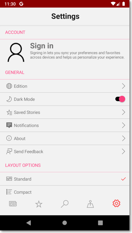
We put some styles on a Switch like this:
But on Android the little knobby thing on the switch doesn't look too great - it's still pink!

Give Android Some More Love!
There are some properties of controls that stil need to be set on the platform. And the little knobby thing on the Android switch is one of them. :)
It's controlled through the styles.xml file found within the Android project.
Specifically the MainTheme.Base -> colorAccent node within that XML file.
If you open that file up, you'll find that node is set to `@color/colorAccent.
Well ... that value for that variable is set in the Colors.xml file. So open that on up.
In there you'll see an XML node of: <color name="colorAccent">#VALUE</color>.
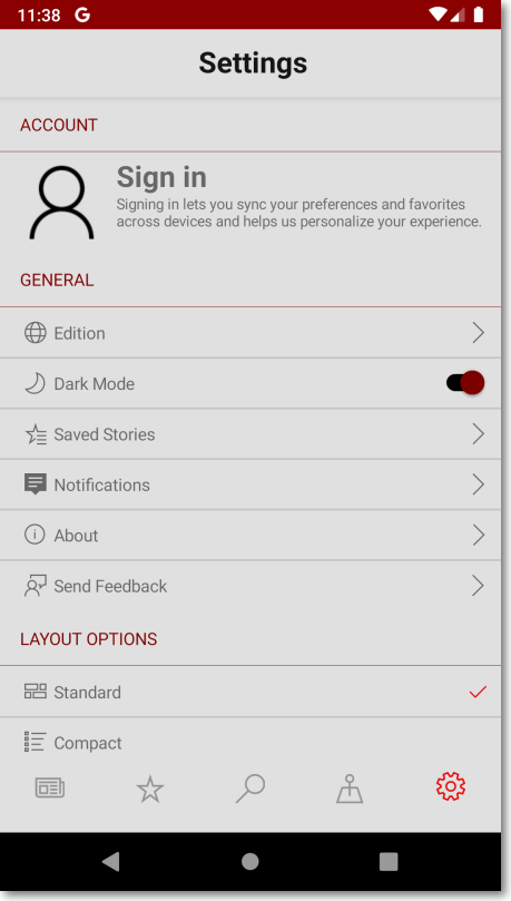
You can change that to whatever you want! I updated mine to #880000 and now the screen looks like this.

And as a side benefit, all of the headers on that screenshot have turned dark red too.
(If you really liked the pink for those headers, there are more fine grained properties to work within the Styles.xml such as colorControlActivated and colorControlHighlight.)
Summary
So there you have it, the UI of our app has been tweaked just a bit to make it look great for the App Store release!
And it wasn't too bad either. A little bit of Visual, a little bit of messing around with iOS XIB files and Android themes and styles... and don't forget, if you want to implement dark mode - put in a PR at this repo!
In the next, and final, episode we'll be putting our app through some DevOps so we can deploy it!
Comments